We've been looking forward to the Touchpad since we saw webOS demoed upon it back in January. HP is rather late getting into the tablet market, but its hoping that its unique operating system will give it the edge and let it compete with the iPad. Unlike the huge number of devices that use Google's Android OS, the Touchpad runs WebOS, which HP acquired when it bought Palm.
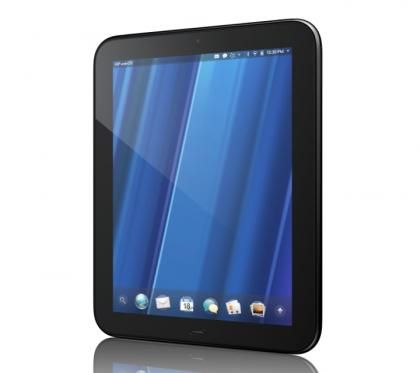
Its black minimalist appearance and high-quality finish are reminiscent of the iPad 2, no bad thing.
This dedicated mobile OS has several advantages over the competition and HP has made a big deal of the Touchpad's multitasking capabilities. WebOS is a true multitasking operating system, and is designed to be as easy to use as a desktop OS.
For the most part this is true, with the OS working with multiple applications and windows in a natural way. When one application opens another, such as when you click a link in an email, the current application minimises and the new one opens. To view all running applications, you either click on the button at the bottom of the tablet, or swipe up from the bottom of the screen. This takes you to the card view, where all running applications are shown as cards on a backdrop.
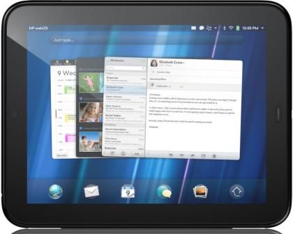
Open apps are displayed as 'cards', with related apps or multiple browser windows stacking on top of each other
Cards that are related to each other, such as the Facebook page you opened when you clicked on a link and the underlying email, appear stacked on top of each other. To close programs you swipe the card up to the top of the screen - no iPad-style double-clicking on the menu button and selecting the application to close from a fiddly list.
Shuffling application cards around and closing them is a fun activity in itself - HP seems to have realised this, as flicking cards down to the bottom of the screen makes them bounce off, bungee-style, and the app is closed with a 'whee!' sound. You can even group cards together in related stacks of your choice: for example, you can put an email your composing with a web page you're using for reference. In terms of organisation, the Touchpad is a lot more intuitive than Android or the iPad. We noticed some occasional slowdowns in the card view when we had several apps open, but the Touchpad generally coped pretty well with performing several tasks at once.

